Fundamentals
Design for transformation
A common misconception among Web designers is that Web page designs are static in the same way as a poster, book, or billboard, resulting in pages that are designed with one view in mind. These pages are generally designed for a standard screen width, text size, column width, line length, and so on. They do not hold up well when subjected to adaptations, such as enlarged type or a wide or narrow browser window. In fact, Web pages are inherently dynamic, transforming themselves to accommodate different access devices and user needs. This adaptability is what sets the Web apart for universal usability, allowing users to transform content to satisfy their needs and preferences. However, with Web pages that are designed to support only one view—pages that use fixed type sizes and column widths—adaptations are either impossible or not useful because these pages do not adapt well (Figure 1.9). For universal usability, designers need to support the adaptability of the Web by anticipating variation in their page designs and by creating pages that transform gracefully.
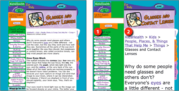
Figure 1.9: KidsHealth uses images for navigation and a fixed column width. When users enlarge text, the links do not enlarge (1) and the text column does not expand (2). www.kidshealth.org
While the foundational aspects of a Web page are determined by the designer—for example, the order of elements in the code, the size and content of images—many of the presentational aspects, such as colors, typeface, and text size, are merely suggestions. These attributes change, depending on the device used to access the page and on the preferences of the user (Figure 1.10).
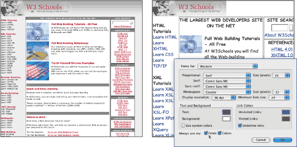
Figure 1.10: Users may opt to use their own fonts and colors when browsing the Web, which can dramatically alter the look of a Web page. www.w3schools.com
Color, for example, is highly unpredictable. On the one hand, users can override color settings and apply their own colors. But even when a page is viewed with its original colors, the color values vary dramatically, depending on whether the page is viewed on a cell phone, laptop, high-resolution display, or via a projector. To design for color transformation, use high-contrast colors that will hold up to variable conditions.
Page width is another common variable. In the early days of the Web, most users accessed Web pages using a desktop computer. Decisions about page width were made based on width of the smallest monitor currently in use. Today, the variety of access devices makes it unrealistic to design for a certain screen width. To design for variable screen dimensions, use flexible layouts that adapt to different window widths.
Variations in text size also influence the page design. Different browsers come with different default text sizes. Users can adjust text size using the zoom feature. In addition, display resolution settings influence the way text displays in the browser. Pages that are designed for transformation respond gracefully to variations in text size. To accommodate different text sizes, use simple, flexible layouts that maintain their integrity with enlarged text (Figure 1.11).
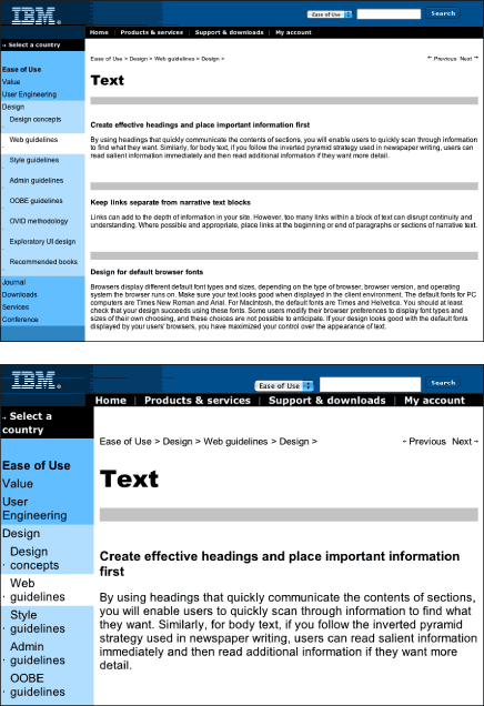
Figure 1.11: The IBM Ease of Use site uses a simple, flexible design that can accommodate different window widths and enlarged text. www.ibm.com/easy/