Links
Introduction
Links are to the web as a steering wheel is to a car: they enable users to navigate their course through hypertext documents. Like a car without a steering wheel, a Web page without links is of little service. When using the Web, we spend much—even most—of our time following links. Therefore, links must be functional and usable.
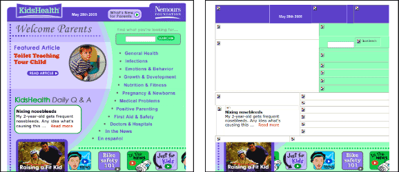
Links are best displayed as text. Although images can be used for links, they are not flexible, which means that people who need a customized view may not be able to access image links. Additionally, image links without alt-text are virtually useless to nonvisual users because they do not provide descriptive information in a format that is machine-readable (Figure 10.1). Given that text is the most accessible form of content, links displayed as text are the most likely to be usable by all.

Figure 10.1: Alt-text makes images "visible" to nonvisual users. When sites, such as KidsHealth, do not provide alt-text with their image links, nonvisual users have no way of knowing how to navigate the site. www.kidshealth.org
From an editorial perspective, links can be made more accessible and usable when we carefully consider the text we use to describe them. Links that are not descriptive require users to read the surrounding text—or worse, to follow the link to determine its destination. Link text should describe the target of the link, beginning with descriptive keywords to facilitate scanning. For example, "Learn more about reading tea leaves" is easier to scan than "Learn more about reading tea leaves."
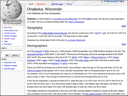
From a design perspective, links must be visually differentiated from other page elements so that users can identify them. Inline text links should be colored and underlined. Navigation links should be set off by their design and location—for example, by marking them with borders or tabs and placing them along the top or left column of the page. In terms of color, visited links should be colored differently from regular links so that users know which pages they have already visited. Links to the current page should be identified using color or some other visible highlight that tells the user "You are here" (Figure 10.2).

Figure 10.2: Wikipedia does a good job of differentiating different types of links. Inline links are colored and underlined, and visited and unvisited links are distinct. The current page is clearly identified, as are links to other sections, the search feature, and the toolbox links. www.wikipedia.org

