Page Layout
Use style sheets for layout whenever possible
Flexibility is what sets the Web apart from other communication and information technologies as a medium for universal usability. Information contained in a fixed medium—such as a newspaper, book, television program, or street sign—cannot adapt to the requirements of the user. The designer of a book must make decisions about aspects of the book. Inevitably, the decisions will interfere with access. For example, some users will find the text size too small for reading. The designer of a Web page must also make design decisions, and the decisions may also affect access for some users. However, because the Web is a flexible medium, users can adapt designs to meet their access requirements—if the text is too small, the user can enlarge it. Transformations need not be limited to altering text size. When style sheets are used for layout, almost all aspects of a Web page design can be transformed.
Maximum flexibility comes from a total separation of content and presentation—when content is contained in a structured HTML document and presentation is handled via style sheets. Pages cannot be easily transformed when styles are not used to define page layout. Layout features, such as columns and positioning, must be defined along with content in the HTML document. In this case, content and presentation are bound together, and transformations are difficult, if not impossible, to achieve. On the other hand, layouts that are defined using structural markup and style sheets are highly adaptable. Since the layout information is separate from the content, pages can be easily transformed by applying different style settings. Users can access pages without any styling, or by using their own custom style sheet (Figure 15.11). Pages can have different layouts depending on the access device used—a PDA may use one layout and a computer display another. Sites can offer different views—print, large text, text only, and high contrast—simply by switching style sheets.
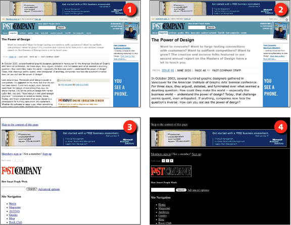
Figure 15.11: Fast Company uses style sheets for layout, making pages easy to adapt by applying different styles. Users can choose different font sizes (1, 2) using the built-in font-size switcher, or choose to view pages without styles (3) or with a custom style sheet (4). www.fastcompany.com